Norwegian banknotes: Original design and main concept
Metric Design and illustrator Terje Tønnesen have developed the design and visual concept used for the obverse faces of the new Norwegian banknotes.
Background
In 2019, The Central Bank Of Norway completed the country’s eighth banknote series. This time the traditional portraits were replaced by motifs that tell a coherent story of the country's relationship with the sea.
More than 70 agencies and artists initially entered. Of these, eight were selected to submit proposals. Norges Bank then decided to further develop a combination of two entries for the final notes. Metric Design and illustrator Terje Tønnesen's concept was chosen for the obverse faces, and Snøhetta's entry for the reverse faces. Here is a presentation of the designs for the obverse faces; how we arrived at the concept and why they look like they do.
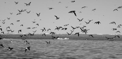
The Ocean
Norway is a coastal nation. The Norwegian coastline is unique on a world scale; it is Europe’s longest and extends over 13 latitudes. 90% of Norway’s population live within 10 km of the ocean. When it comes to productivity, diversity in species and distinctive character, it is unparalleled throughout the world. The Norwegian livelihood is the ocean - it is the origin of our most important resources. It is our food basket and our major source of income. It is also the origin of our shared history and knowledge - a source to our worldview and our identity.
«The banknote motifs are all about how Norwegians use the ocean; about how we combine our access to resources with knowledge and how the ocean affects the Norwegian way of life and social model»
The banknote motifs are all about how Norwegians use the ocean; about how we combine our access to resources with knowledge and how the ocean affects the Norwegian way of life and social model - both politically and socially.
In its own way, each note represents something about the Norwegian way of life; its identity, cultural heritage and society. In line with Norwegian society ideals, we decided early on that the notes would represent all the people and all parts of the country through both theme and form. Therefore, it’s important that the notes are uncontroversial and give positive connotations, whilst at the same time be open for reflection on the theme they portray. These are notes that all Norwegians can take proud ownership of, in the same way that the entire coast is owned by the Norwegian people.
Norwegians are proud of the unique nature they inhabit and all have their own personal relationship with it. Each note is designed to inspire, and recall positive feelings and fond memories of the coast. The Norwegian coastline is of huge topographical variation; from flat rocks to dramatic mountain cliffs, mile-long sandy beaches and majestic fjords. Below the surface the diversity is enormous.
In our proposal, all parts of the coast were incorporated on the reverse face of the notes. Thus, allowing for the whole of the country to be represented in the series. However, the reverse motifs were not used in the final notes.

The design, typography, visual concept and artistic expression
Banknotes are not just a printed document with colour, design and denomination. They are sophisticated and highly advanced technical objects which contain numerous intricate security elements and codes - both visible and invisible. These codes allow them to be used by machines and people, and ensure the security and reliability of the financial system. The Norwegian banknotes are printed on cotton paper and go through a number of print techniques; offset, screenprint, foil, intaglio, UV etc are each techniques that affect how a banknote looks and how the visual elements can be composed. Tradition and general expectations for how banknotes look are also important to fuctionality. Internationally, banknotes have a universal visual language with their own visual codes - a “banknote design language”, so to speak. This language distinguishes the notes from other designed objects and meets the general expectations for money. It was important to safeguard this language on the obverse face of the notes in order to secure trust. It was also important that the notes reflect a national identity.
Norwegian design reflects the Nordic ideals. Typically, modern Norwegian design is built on rational and functional solutions. Meanwhile we are surrounded by powerful, dramatic scenery and weather. The banknote designs mirror these contrasts. The typography and composition is distinct and intuitive, and depicts the banknotes primary function – to clearly show the denomination and value.
«Modern Norwegian design is rational and functional. Meanwhile we are surrounded by powerful, dramatic scenery and weather»
Whereas Norwegian design is often considered functional and safe, Norwegian arts and crafts are traditionally abundant, having been influenced by nature, the climate and the seasons. The traditional, symbolic imagery is still valued by many Norwegians, and therefore its relevance helps support the banknote language. So it was natural to give the icons on the obverse faces a traditional look. All the images were initially hand drawn by Norwegian illustrator Terje Tønnesen.

The classic illustration style is framed by a modern, logical template. Behind the icons is the ornate graphic pattern and play on denomination that helps support the story behind each note, and which have been adapted for the extensive work the designers at Norges Bank have to do to transform the designs into actual money. This has produced a series that supports the general expectations of banknotes, along with reflecting Nordic modernity.
The notes
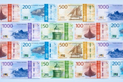
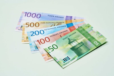
Norwegian banknotes come in 50, 100, 200, 500 and 1000 kroner denominations. The banknotes were finalized by the design department at Norges Bank; the first two - the 100 kroner and 200 kroner notes - were put into circulation during the spring of 2017. The 50 kroner and 500 kroner notes in 2018. The 1000 kroner note was issued in November of 2019.
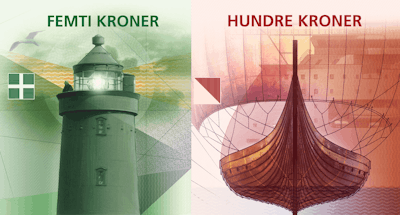
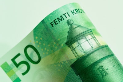
50 Kroner. The ocean which binds us together
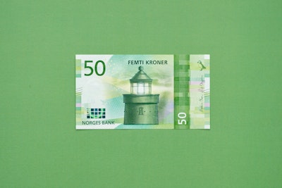
Icon: Utvær lighthouse in Sogn and Fjordane, Norway’s westernmost point
Years ago, the coast was the only way possible to travel the length and breadth of Norway. High mountains prevented Norwegians from crossing the country over land. The expansion of lighthouses in Norway throughout the 1800’s simplified coastal traffic, making it safer and more streamlined, and therefore central to industrial development, trade, communications and the nation. The lighthouse system made distances shorter and the coast more compact, helping to bind the country together. The background illustration is a detail of latitudes from an old sea chart, and the seagull a symbol of what connects the sea, air and land.
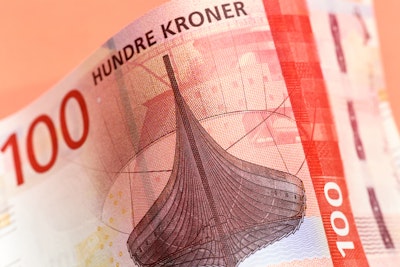
100 Kroner. The ocean which takes us out into the world
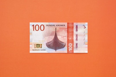
Icon: Technical presentation of the Viking ship Gokstadskipet
Norwegians are known for - and proud of - their mighty Viking heritage. The Vikings were our first traders and explorers, and dominated the sea from the 700’s. They laid the foundations for Norway to become one of the world’s leading maritime nations. Gokstadskipet from the 800’s is Norway’s most famous ocean-going Viking ship. It was used as a vessel for commercial travel, discoveries and expeditions. The Vikings were formidable ship builders and their legacy stills shines on throughout much of Norway’s engineering today; depicted here in the form of the X-bow ship in the foreground. The background pattern shows details from the schematic representation of export lines for oil and gas from Norway to Europe.

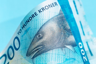
200 Kroner. The ocean that feeds us
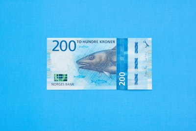
Icon: Cod and herring
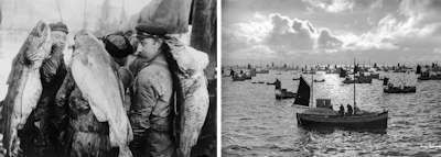
Cod and herring have been the most significant fish in the development of Norway as a fishing nation - for many years cod was the largest Norwegian export. Cod and herring have affected the Norwegian settlement pattern and without cod particularly, Norwegians wouldn’t have lived so scattered along the coastline of Norway. The near endless supply of fish is also the main reason why Norway has gone without any real hunger. The background illustration shows knotted mesh from a fishing net - this type of mesh was a very important innovation in fishing history. It multiplied efficiency and contributed to a significant growth in the fishing industry.

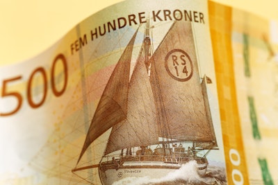
500 Kroner. The sea that gives us prosperity
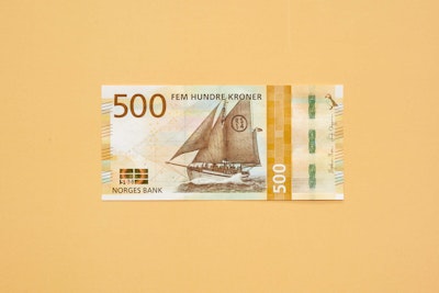
Icon: The sea rescue boat RS 14 Stavanger
The welfare state is an important social and political principle in Norway, and has nothing to do with material wealth. It was established long before the discovery of oil and gas in the North Sea - which made Norway a wealthy country. The establishment of Redningselskapet – the Norwegian Society for Sea Rescue – in 1891 was an important step in the development of the welfare state. The idea of the rescue company verifies one of the most important ideals that society is built upon. That the country takes responsibility for people’s safety and welfare. Redningselskapet have made some of our most important, but dangerous workplaces considerably safer. It has secured people’s ability to establish social and business activity in vulnerable areas, with the reassurance that they are taken care of. This is something Norwegians take for granted today, but internationally is less common. Therefore, the rescue company serves as a symbol for the idea of the Norwegian welfare state. The background illustration shows a detail of ship architect Colin Archer’s drawing of RS 14 Stavanger.
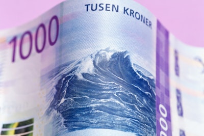
1000 Kroner. The sea which carries us forward
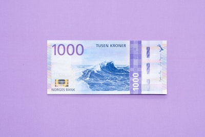
Icon: Wave
The wave is the ocean itself. It is both constant and changeable at the same time. The wave represents something eternal; something past and present. The future is uncertain, but for us to use the ocean to bring us forward, we must be able to look back and use the knowledge and experience the ocean has given us to make the right choices. The background illustration shows a simplified detail from a technical monitoring map of the Barents Sea. The Barents Sea is one of the key development areas of the Northern hemisphere.
The High North region is one of the most productive coastal areas in the world and the diversity in species is incomparable. This is the region where the fish that end up on our dinner tables spawn. It is also where the majority of the most important marine research takes place, and it is in these areas that there is the greatest development within the maritime field. The note can remind us of just how fragile an ecosystem we are a part of, and that we must manage it accordingly. Only then can the ocean actually bring us further.
The reverse faces
Metric´s proposal for the reverse face of the banknotes was not selected for the final versions - instead Norges Bank further developed a visual proposal from Snøhetta.
See the reverse faces here.
Further reading about the new Norwegian Banknotes:
Follow this link to read everything about the new Norwegian banknotes on Norges Bank's webpage.